How updated is my Tufte CSS, actually?
When I set up this blog I asked Claude for a more modern build of Tufte CSS: something that worked with React and Tailwind and didn't fall apart on a phone. I half expected a tidy-up. What came back is closer to a rebuild, so how much of it is actually new?
Next to 1.9.0
I checked it against Tufte CSS 1.9.0, the current release. Upstream is one stylesheet of about 460 lines and one Playwright regression test. The kit is about 3,400 lines once you count the React components, the Markdown plugin and the tests; around 165 tests per browser engine, across Chromium, Firefox and WebKit.
What it keeps is the part that matters: ET Book, the proportions of text to margin, sidenotes beside the line they belong to, and the restraint.
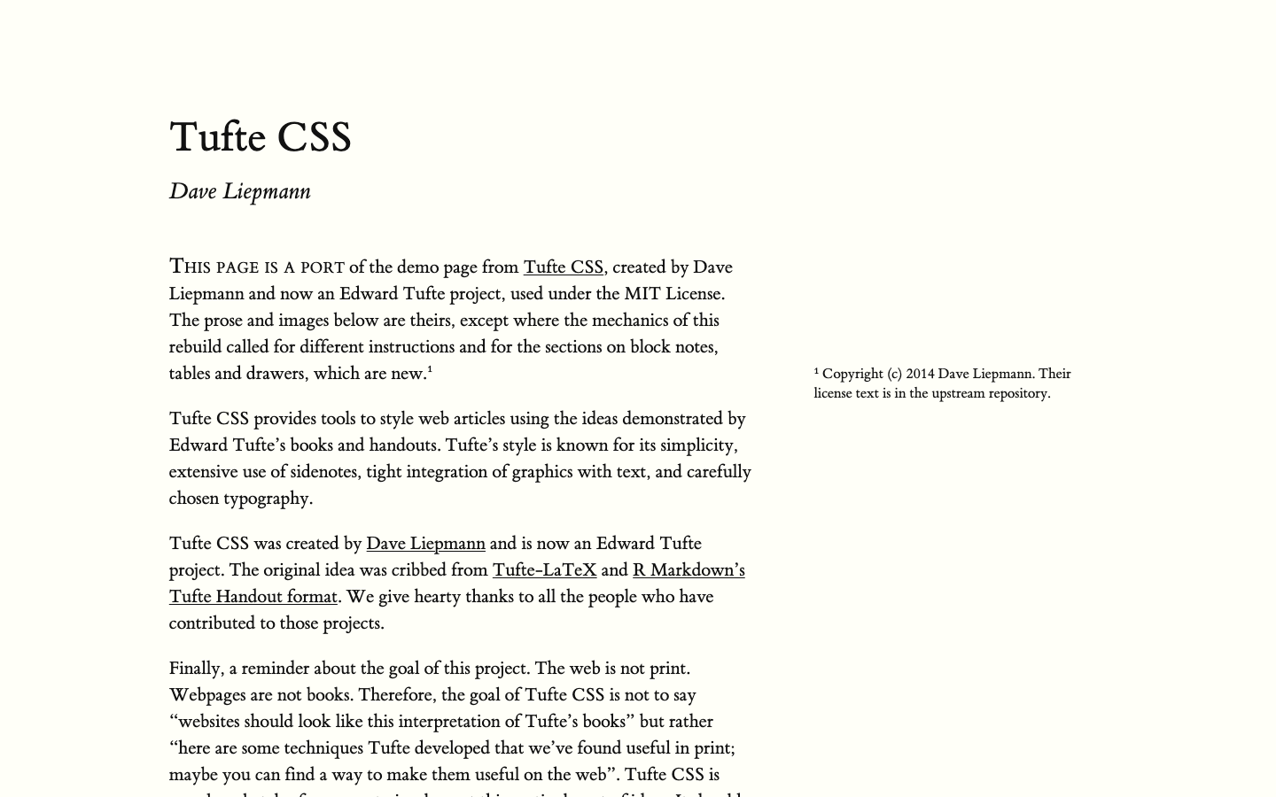
Everything around that changed. Below 760px upstream hides the notes behind a number or a ⊕; the kit keeps the margin, just past the edge of the screen, and you swipe to it. Upstream sizes itself to the browser window; the kit uses container queries, so it fits any column and holds its proportions at the in-between widths where upstream's text column gets too narrow. It sits in its own cascade layer and only styles what's inside the article, so it neither breaks a site nor gets broken by it.
Anything too big for the margin opens as a drawer. And where upstream wants hand-written HTML, the kit takes plain Markdown, or React components when a post needs them.
The margin stays a margin
The phone was the decision I actually cared about. Hiding notes behind a tiny ⊕ technically works, but nobody knows to tap it, and going back and forth between a note and the text is slow. The obvious fixes, pouring the note into the text or popping it up as a bottom sheet, stop it being a margin note at all. I said no to both.
I tried a lot of options on my actual phone. The one I picked keeps the margin just off the right edge, with a plain word such as "note 1" set sideways in the sliver that's still visible. Swipe the page and the margin slides in, level with its line. It's a word, not a button, so it doesn't clutter the page, and I like what that does for the data-ink ratio.
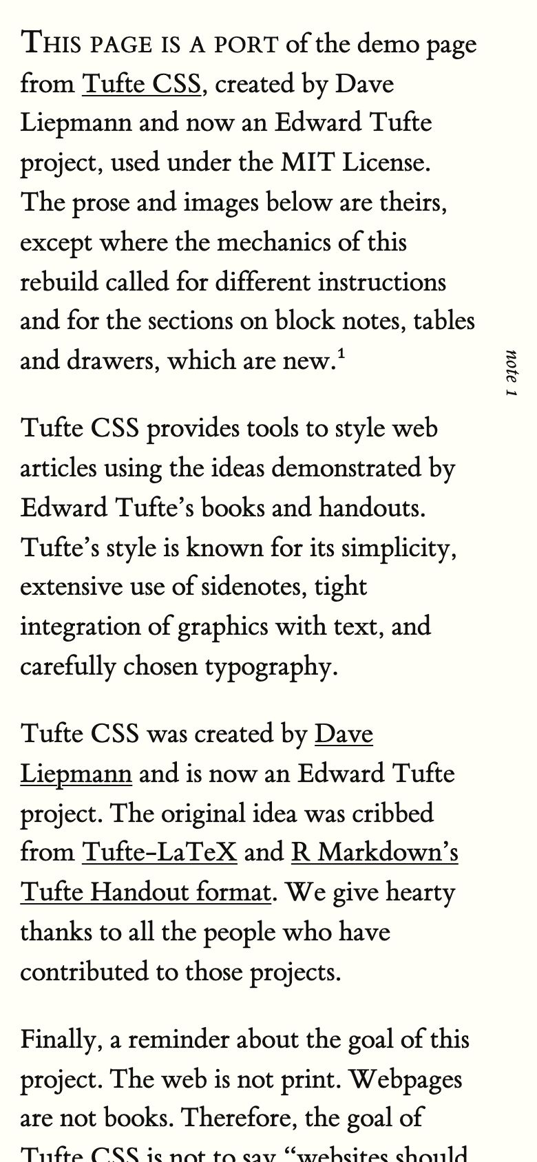
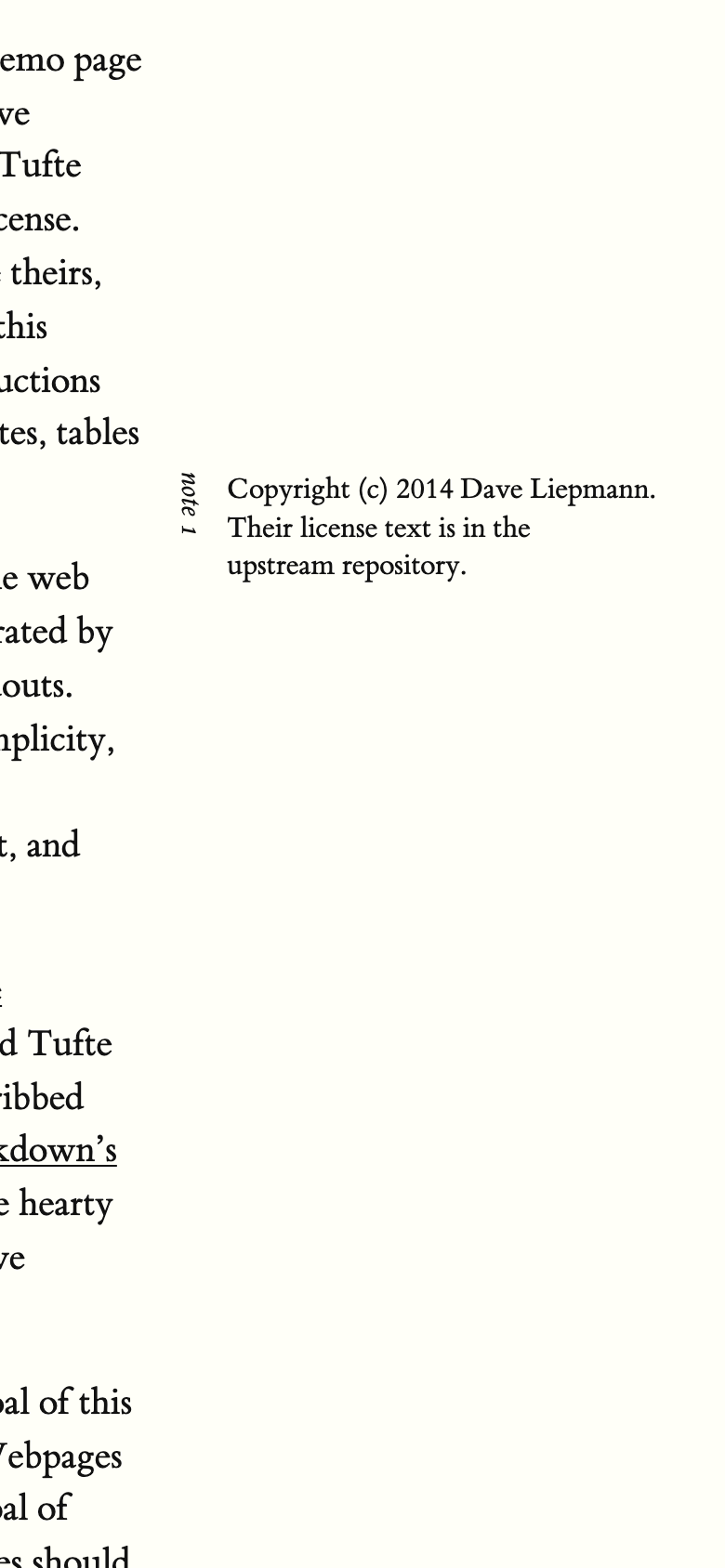
Two bugs only showed up on a real phone. Tapping a marker used to scroll the page up and down to center the note, which was disorienting; now it only ever moves sideways. And a map in the margin vanished the moment you tapped it, because the browser decided it was off-screen and hid it. Not one of the automated tests caught either of them. My phone did.
Is it its own project yet?
Almost. It lives in my fork of Tufte CSS, on its own branch, so the link back to the original stays attached. Tufte CSS is by Dave Liepmann and is now an Edward Tufte project; the kit keeps its MIT license.
It isn't finished. The open bugs are mostly Safari keyboard focus and drawers at phone widths, the fonts need a licensing check before anyone else installs it, and the swipe needs testing on more real phones than mine. They're all listed in the README.
This post was written using Claude. I am working through a backlog of posts and topics, and I don't want to keep delaying. I hope to revise this post myself and remove this comment in the near future.